Since our last major update, we've been hard at work making Vyssuals more flexible and intuitive. While there's been significant under-the-hood work to improve performance and reliability, this release also introduces a major UX improvement that transforms how you organize and interact with your data visualizations.
The Infinite Canvas: Your Dashboard, Your Way
Every building is unique. Every project has different data needs. Every team works differently.
That's why we've introduced a Miro-style infinite canvas where you can:
- Drag and drop charts anywhere on the canvas
- Resize charts to emphasize what matters most
- Organize by logic, not by grid constraints
- Zoom and pan to focus on different parts of your analysis
- Work the way you think - no rigid system dictating the pace
This isn't just a layout change. It's a fundamental shift toward giving you the flexibility to iterate, check, change, and correct without fighting against the tool.
The canvas remembers your layout automatically, so you can pick up exactly where you left off. Create multiple dashboards with different arrangements for different use cases - compare design options, analyze different building phases, or set up views optimized for different team members.
Enhanced Filtering: More Power, More Precision
Chart Filters: Starts With and Ends With
Sometimes you need to find all elements that begin with a specific prefix or end with a particular suffix.
Chart filters now support "starts with" and "ends with" operators, giving you more precise control over text-based filtering. These operators are especially powerful when combined with other filter types to create complex, targeted queries.
Dashboard-Wide Filters: Now As Powerful As Chart Filters
Previously, dashboard-wide filters were limited to simple checkbox lists showing all possible values. While useful for quick selections, they couldn't handle the nuanced filtering needs that come up in real-world BIM projects.
That's all changed.
Dashboard-wide filters now support all the same filter types as chart filters:
- Equals / Not equals
- Contains / Not contains
- Starts with / Ends with
- Greater than / Less than (and their "or equal" variants)
- Is null / Is not null
- Is empty / Is not empty
- Regular expressions (contains / not contains)
- In / Not in (for multiple values)
More importantly, you can now combine multiple filters with AND/OR logic. Need to filter for elements on levels A and B that are either empty or contain a specific value? You can build that filter exactly how you think about it.
This makes dashboard-wide filters a powerful shortcut right to the information you need to know.
Visual Drill-Down: See What You're Selecting
When you drill down into a bar chart or pie chart by clicking on a segment, you need to understand what elements you're looking at. In Revit, this understanding comes from seeing those elements in context.
Ghosted Visualization for Drill-Downs
Now when you drill down into a chart, other elements are automatically ghosted in the 3D view. The elements you've selected remain fully visible, while everything else becomes transparent. This gives you instant visual feedback about:
- Where the selected elements are in the building
- What other elements surround them
- How they relate to the rest of the model
This visual feedback makes it much easier to understand your data in its spatial context. Instead of just seeing IDs in a table, you can immediately see the physical reality of what your analysis has selected.
Context Data Ghosting: See Everything in Context
The same ghosting capability extends to context data in the Revit connector. When you turn off "isolate categories" in the chart editor, context data is now shown as ghosted elements in the 3D view.
This is particularly powerful when analyzing:
- Multi-category relationships: See how elements from different categories interact spatially
- Parameter existence: Understand which families or instances have certain parameters
- Cross-category analysis: Analyze relationships between structural, MEP, and architectural elements
By keeping context elements visible (but ghosted), you maintain spatial awareness while focusing on the elements your chart highlights.
Integrated Context Table: Data Where You Need It
The fixed context table at the bottom of the screen served its purpose, but it took up valuable screen space and wasn't always where you needed it. Every chart might need different context information, and forcing it into a single fixed location didn't make sense.
The context table is now integrated directly into charts.
Each chart can be expanded to show its underlying data in table form alongside the visualization. This means:
- Context when you need it: Expand only the charts you're actively analyzing
- More screen space: No fixed UI elements taking up space when you don't need them
- Better organization: Each chart's data stays with that chart
- Flexible layouts: Arrange expanded charts on the canvas just like regular charts
You can still drill down, select elements in Revit, and explore your data - but now it's all contained within the chart itself. This creates a more cohesive, less cluttered interface.
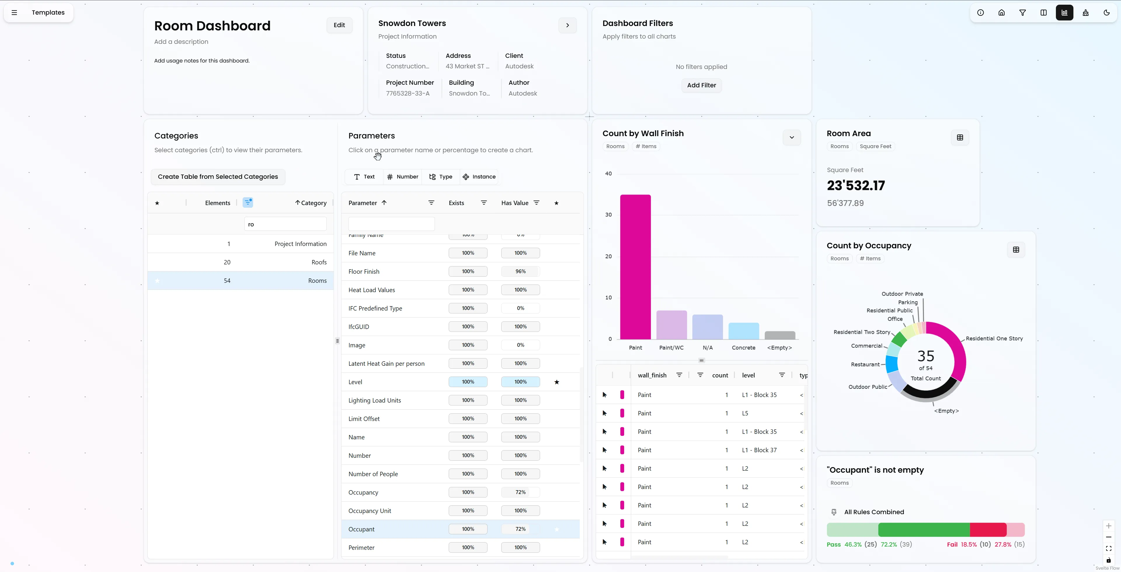
Unified Categories and Parameters Panel
Understanding the relationship between categories and parameters is fundamental to working with BIM data. Previously, categories were on the left side of the screen and parameters were on the right. This separation, while visually distinct, didn't make the relationship obvious.
Categories and parameters are now in a single element on the canvas.
By putting them next to each other, it becomes immediately clear that selecting a category filters the list of parameters. This reflects the natural hierarchy of BIM data: elements belong to categories, and parameters describe those elements.
Quick Table Creation
The categories list now includes a shortcut button to instantly create a table canvas element containing all elements of the selected category. Parameters tagged with a star (your favorites) are automatically added as columns, so you can jump straight into detailed analysis without manual setup.
This is particularly useful for quality checks and data validation - select a category, create a table, and immediately see all relevant information organized exactly how you need it. Revit's built-in schedules really are from the stone age...
Smarter Parameter Analysis: Fill State Split
The "fill state" column in the parameters list showed completion percentage, but it didn't distinguish between two very different scenarios:
- Does the parameter exist? - Is this parameter defined for elements in the selected categories?
- Is the parameter empty? - For elements where the parameter exists, what percentage have empty values?
These are fundamentally different questions that require different analysis approaches.
Two Distinct Metrics
The fill state column has been split into two columns:
Parameter Exists - Takes into account the selected categories. This answers questions like:
- "How many walls have a fire rating parameter?" (when walls are selected)
- "Which door and window instances have this custom parameter?" (important because loadable families can have parameters specified per family, not per category)
Empty Percent - Based only on elements where the parameter exists. This answers:
- "Of the walls that have a fire rating, how many are missing values?"
- "What percentage of doors with this parameter still need to be filled in?"
This distinction is critical for data quality analysis. You can't fix empty values if the parameter doesn't exist on those elements, and you shouldn't duplicate parameters that already exist. The split makes it clear which action is needed.
Quick Rule Chart Creation
Clicking on either fill state indicator creates a rule chart automatically configured to analyze that specific scenario. This lets you dig deeper into:
- Which elements are missing parameters
- Which elements have parameters but no values
- Patterns in parameter completeness across types, levels, or other groupings
Rule charts give you the detailed analysis you need to take action on data quality issues.
What This Means for Your Workflow
Faster Iteration
The infinite canvas removes layout constraints that slow you down. Arrange charts based on your thought process, resize based on importance. Zoom in on the analysis you're actively working on. Zoom out for an overview and to orient yourself.
Better Understanding
Ghosted elements in drill-downs and context data give you immediate spatial understanding. You're not just seeing data points - you're seeing how those data points relate to the physical building.
More Powerful Filtering
Dashboard-wide filters with full operator support and AND/OR logic let you narrow down your entire analysis with precision.
Clearer Data Quality Analysis
The split fill state columns make it immediately obvious whether you're dealing with missing parameters or missing values. This clarity translates directly into faster data quality improvements.
Integrated, Not Fragmented
The integrated context table and unified categories/parameters panel create a more cohesive interface. Everything you need for a specific analysis stays together, reducing cognitive load and making workflows smoother.
The Philosophy: Flexibility and Clarity
This release reflects a core philosophy: Every building is unique. A prototype of itself.
You need flexibility - an infinite canvas to think freely. You need clarity - visual feedback that connects data to reality. You need power - filters that work the way you think.
You shouldn't have to work around the tool. The tool should work with you.
Quantity has a quality of its own: The ability to just plainly do more iterations than the competition can give you a significant edge.
Looking Ahead
Release 0.6.0 represents a significant step in making Vyssuals more flexible and intuitive. The infinite canvas, enhanced filtering, and visual feedback systems create a foundation for even more powerful workflows in the future.
But we're not stopping here. We're already working on the next improvements that will make your data work even harder for you.
The goal remains: transform how you think about BIM data from something you extract after the fact into an integral part of your design process.
Ready to experience the difference? These updates are available now. Start arranging your charts your way, filter with precision, and see your data in its spatial context like never before.
Want to see these features in action? Check out our tutorial videos or get started with Vyssuals today.